Each section on the landing page corresponds to a specific template with its own set of parameters for customisation. There are (currently) 4 templates.
Utilizes the image-compare-viewer library by Kyle Wetton to compare multiple before and after images. Includes an auto-generated tab to switch between image comparison sets.
notifications
Additional templates and template types are part of the Lotus Docs roadmap
For each enabled section defined in your data file (/data/landing.yaml), the following parameters are required:
Choose a unique name for each section array defined in the data file. e.g. myCoolHero for the section using the hero template.
weight - This key is nested under a section’s array title. It’s value defines where in the landing page the section should appear. Sections with lower values appear higher up on the rendered landing page.
template - This key defines the template the section should use.
Here’s an example of how the weight key (lines 4, 11, and 18 below) is used to configure the order in which sections on the landing page appear:
  # Hero
myCoolHero: # section title
  enable: true
  weight: 10 # position the 'myCoolHero' section at the top of the landing page
  template: hero # use the 'hero' template for this section
  ...

# Feature Grid
coolAppFeatures:
  enable: true
  weight: 20
  template: feature grid
  ...

# Image Compare
appImageCompare:
  enable: true
  weight: 30
  template: image compare
  ...
This diagram illustrates the order in which each section configured in the first tab will appear once the landing page is rendered.
Each section defined in the landing.yaml configuration has an id auto-generated using the section name. So a section named appImageCompare can be linked using the anchor /#appImageCompare. This is useful for linking from one section to another on the landing page.
Set the asset directory path where your hero image is located.
image.filename
N/A
Set the name of the hero image file to use. Support for .jpg, .png, .webp, and .svg image formats.
image.alt
N/A
Set the the alt text for the hero image (optional).
image.boxShadow
false
Enable a subtle CSS box-shadow for the hero image? (does not support .svg image formats)
image.rounded
false
Enable rounded corners for the top of the image (utilizes Bootstrap’s rounded-top-4). (does not support .svg image formats)
  # landing.yaml
heroSection:
    ...
    ctaButton:
        icon: rocket_launch
        btnText: "Get Started"
        url: "/docs/quickstart/#create-a-new-lotus-docs-site"
    cta2Button:
        icon: construction
        btnText: "In Development"
        url: "https://github.com/colinwilson/lotusdocs"
Parameter
Default Value
Description
ctaButton.icon, cta2Button.icon
N/A
Define a Material Symbol icon for the button. e.g. setting the value to rocket_launch will prefix the button text with a rocket_launch icon. (optional)
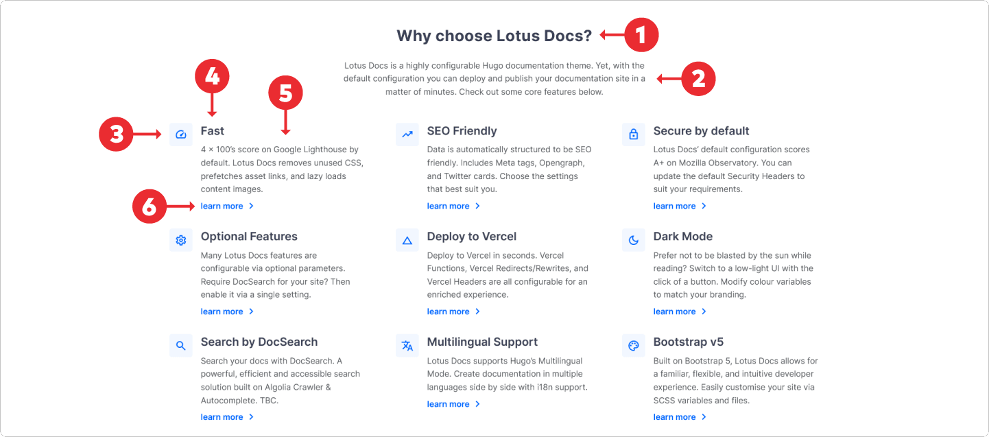
The feature grid template has 5 configurable components. The illustration below demonstrates a rendered layout of these components.
  # landing.yaml
featureGrid:
    ...
    title: Why choose Lotus Docs? # 1
    subtitle: Lotus Docs is a highly configurable Hugo documentation theme. Yet, with the default configuration you can deploy and publish your documentation site in a matter of minutes. Check out some core features below. # 2
Parameter
Default Value
Description
title
N/A
The main title of the feature grid template (h4 sized font).
subtitle
N/A
Subheading text. Supports Markdown.
  # landing.yaml
featureGrid:
    ...
    items:
    - title: Fast # 4
      icon: speed # 3
      description: 4 x 100's score on Google Lighthouse by default. Lotus Docs removes unused CSS, prefetches asset links, and lazy loads content images. # 5
      ctaLink: # 6
        text: learn more
        url: /docs/

    - title: SEO Friendly
      icon: trending_up
      description: Data is automatically structured to be SEO friendly. Includes Meta tags, Opengraph, and Twitter cards. Choose the settings that best suit you.
      ctaLink:
        text: learn more
        url: /docs/
    ...
Parameter
Default Value
Description
items.title
N/A
Set the title for the feature item.
items.icon
N/A
Set the Material Symbol icon for the feature item. e.g. setting the value to trending_up will prefix the item’s title text with a trending_up icon. (optional)
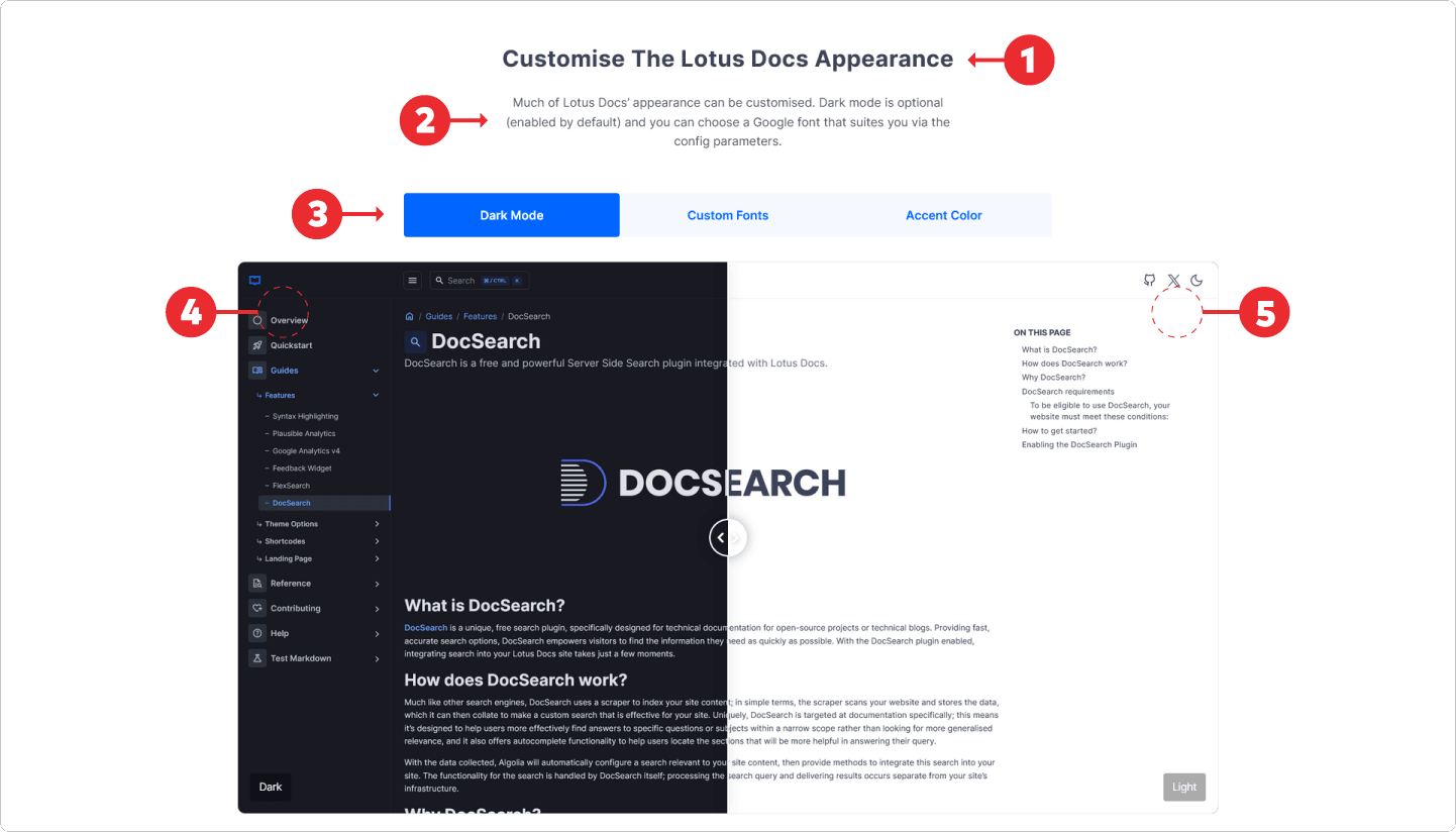
The image compare template allows multiple image comparisons to be presented in a single section. Each pair or compared images are selected by tabs. The template has 5 configurable components. See the illustration below for a rendered layout of these components.
  # landing.yaml
imageCompare:
    ...
    title: Customise The Lotus Docs Appearance # 1
    subtitle: Much of Lotus Docs' appearance can be customised. Dark mode is optional (enabled by default) and you can choose a Google font that suites you via the config parameters. #2
Parameter
Default Value
Description
title
N/A
The main title of the image compare template (h4 sized font).
subtitle
N/A
Subheading text. Supports Markdown.
This tabbed navigation is auto-generated. Each tab is labelled according to its item title (nested under items. See line 5, 7, 9 below).
The image text template consists of a 2 columns. One with and image and the other with a combination of a title, descriptive text, a list, and a call-to-action link. The image can be position either on the left or the right of the section.
  # landing.yaml
imageText:
    ...
    title: Customise The Lotus Docs Appearance # 1
    subtitle: Much of Lotus Docs' appearance can be customised. Dark mode is optional (enabled by default) and you can choose a Google font that suites you via the config parameters. #2
Parameter
Default Value
Description
title
N/A
The main title of the image text template (h4 sized font).
subtitle
N/A
Subheading text. Supports Markdown.
# landing.yaml
imageText:
...
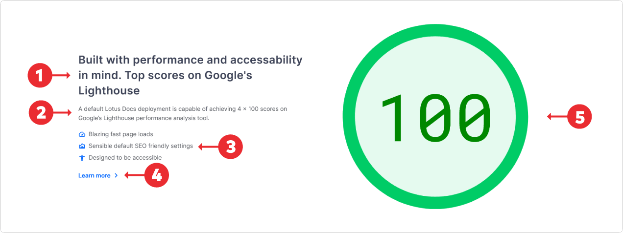
list:
- text: Blazing fast page loads
icon: speed
- text: Sensible default SEO friendly settings
icon: area_chart
- text: Designed to be accessible
icon: accessibility
...